How to Make a Glitch Text Image Without Photoshop
Make a glitch text image without Photoshop using RGB Split and Slice Shift. Download the practice lettering, adjust the effect, and export a PNG.

You can make a glitch text image without Photoshop by uploading a lettering PNG to the Glitch demo, adding RGB Split, then using Slice Shift to interrupt a few horizontal bands. Keep the shifts small enough that the word remains readable, and export the result as a PNG.
This is an image workflow. The demo accepts one PNG, JPG, or WebP; it has no text-entry or font controls. Prepare your lettering first, or use the practice image below. The result is an image for your artwork, rather than copy-and-paste Unicode text for a username or bio.
Start with bold, well-spaced lettering
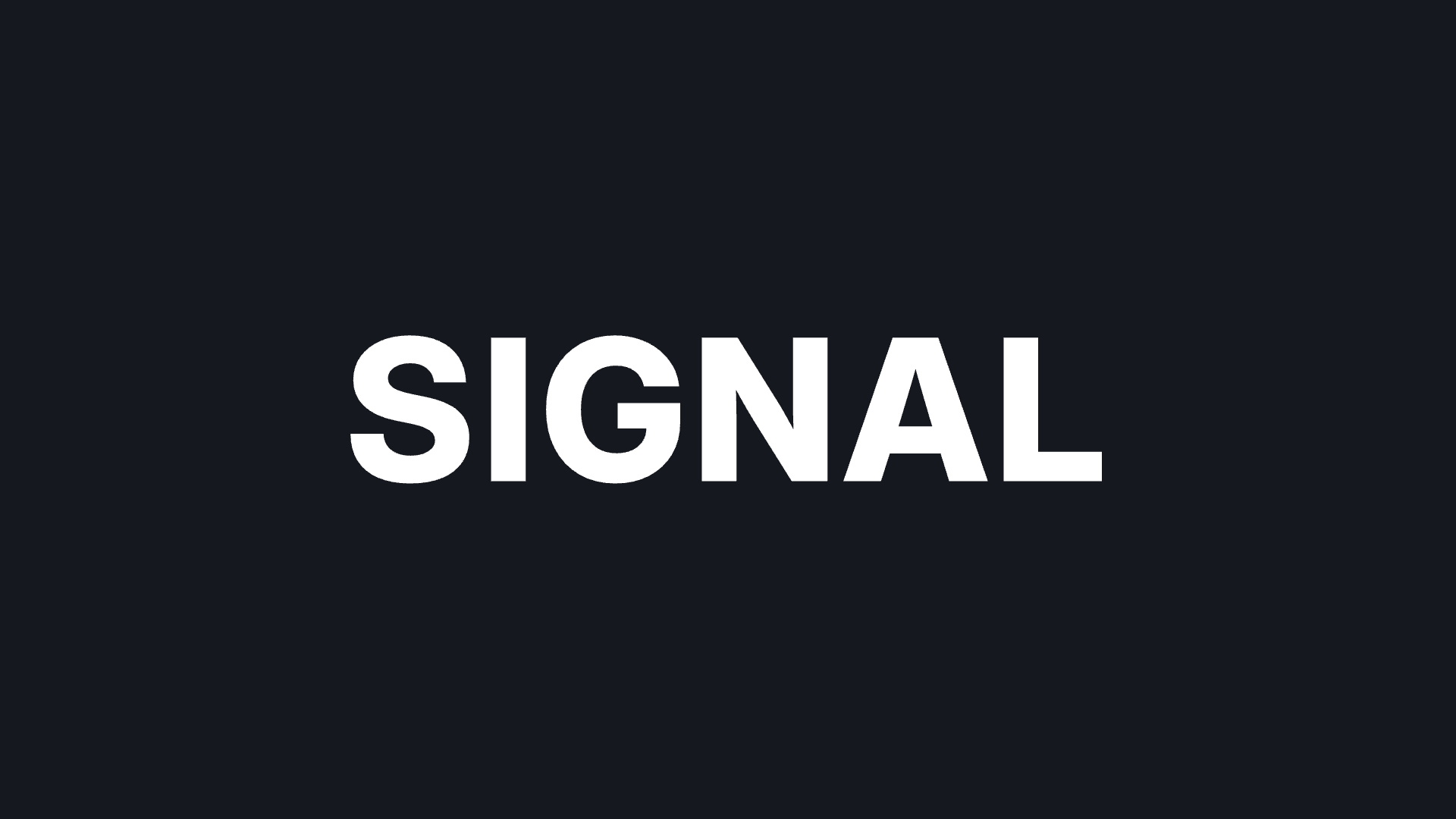
Download the SIGNAL practice PNG
(1920 × 1080). It contains white Inter lettering on an opaque dark background. The broad strokes and open space around the word give the displaced edges room to show.

Source — an opaque PNG, ready to upload. The lettering is already part of the image.
For your own source, use a short headline and leave padding around the edges. Small captions and very thin strokes become harder to read as the channels separate. Bake in your intended background before upload for this recipe; the example does not demonstrate a transparent glitch overlay.
Open the demo with RGB Split, then choose the practice image. Keep the canvas at 1920 × 1080, the image centered at 100% scale, and rotation at 0°. Leave playback paused at Time (s) 0, with Shared animation off. The link selects RGB Split at its current default; enter the tutorial settings yourself.
Separate the color edges
Expand RGB Split in Active FX. Turn Animate: RGB Split off and set Amount to 0.012.

RGB Split alone, with Amount 0.012. The white centers still hold the word together.
RGB Split offsets red and blue horizontally while keeping green aligned. Look at the straight stem of the I and the outer curve of the S: their colored edges reveal the separation clearly. Raising Amount widens the colored copies across the whole image.
If your word already looks doubled, lower Amount before adding another effect. Changing the font is a source-image edit; the demo cannot change the typeface inside an uploaded PNG. The RGB Split guide explains the control and its current default.
Break a few horizontal bands
Add Slice Shift from the FX list. Keep the stack in this order: RGB Split first, Slice Shift second. Turn Animate: Slice Shift off and enter:
- Shift: 0.04
- Coverage: 0.35
- Band height: 2.50%
- Seed: 37
- Mix: 100%
The band near the middle interrupts several letters at once, but their upper and lower shapes still connect visually. Shift controls how far the selected bands can move. Coverage changes how many bands are affected. Band height changes their thickness, and Seed changes the arrangement.
Keep Seed at 37 while comparing strengths. Changing it also changes where the breaks fall. These controls operate across the image; they do not select individual letters or protect a particular word. See the Slice Shift guide for more about the controls.
Find the point where the word stops reading
For comparison, we kept the source, framing, effect order, Band height, Seed, and Mix unchanged, then increased RGB Split Amount to 0.065, Slice Shift’s Shift to 0.16, and Coverage to 0.80.

Too much for a readable headline: the repeated colors and wider slices compete with the word.
The S opens into separate fragments, and colored copies crowd the middle letters. That can suit abstract artwork, but it is a poor trade when the headline needs to read quickly.
To restore the illustrated result:
- Lower RGB Split Amount to 0.012 to bring the color edges closer together.
- Lower Slice Shift’s Shift to 0.04 to reconnect the letter shapes.
- Lower Coverage to 0.35, keeping Band height 2.50%, Seed 37, and Mix 100%.
Inspect the result at the size you plan to use it. If a small preview loses the word, reduce the treatment further. A different source may need different values; matching the settings does not guarantee the same visual balance.
Export the lettering image
Open Settings → Export Settings → Quick Export. Keep Include animation off, choose PNG, and use Original dimensions with Size: Canvas size. Close Settings and choose Quick Export in the editor toolbar.
The practice result is an opaque 1920 × 1080 PNG. Browser export is included. To change the spelling afterward, revise the original lettering and upload the new image; the exported PNG has no editable text layer.
Try the glitch text recipe, or follow the glitch poster walkthrough when you want to treat lettering and graphic shapes together. To type your words and keep them editable while applying effects, use the
editable text effects tutorial for Artfkt on Mac
.
How this example was made
The source was created with bundled Inter in Artfkt and exported with a solid dark background. The three glitch treatments are actual PNG exports from the browser demo using WebGPU, animation off, and playback paused at time 0. Restoring the final settings after the exaggerated treatment reproduced the saved final PNG byte-for-byte in the capture session. That is a local reproducibility check, not a cross-device guarantee. The lettering and article were prepared with AI assistance; the effects shown were rendered by the product.
Make something unexpected
Keep exploring in Artfkt.
Bring all collections and multiple image layers together in one Mac studio. Build a look, shape its motion, and save your next starting point.